Why Liquid Glass suddenly feels overwhelming on Tahoe
After upgrading to Tahoe, many people open their Mac and feel like the whole screen suddenly turned into frosted glass. Sidebars show wallpaper colors bleeding through, the menu bar is hazier, and the Dock looks more see‑through than before. It can look slick in screenshots, but on a real desk, it’s a lot.
On a busy background, text can feel harder to read. Your eyes end up working overtime, trying to separate foreground from background, and long sessions start to feel tiring. You might even hesitate to move windows because every layout change shifts the blur behind them.
Before you start flipping switches, it helps to pin down whether it’s the see‑through effect or the fuzzy blur that’s actually bothering you.
First check: is it the transparency or the blur that’s bothering you?
When the whole screen feels “too much,” it’s hard to tell what, exactly, is causing the strain. You just know everything looks busy and your eyes keep jumping to the background. The quickest way to separate the two culprits is to pause on one window and look carefully at what’s showing through it.
Transparency is the sharp, see‑through part: you can clearly make out icons, window edges, or strong wallpaper shapes behind menus, sidebars, or the Dock. Blur is the soft haze: colors still bleed through, but details smear into a foggy glow that makes nearby text feel less crisp.
To test it, switch to a simple solid‑color desktop, then a loud photo. If the solid color feels fine but the photo makes everything chaotic, transparency is the main problem. If both feel washed out or “milky,” the blur is doing the damage. Once you’ve spotted which one dominates, you can use the system sliders more precisely instead of flattening the entire interface.
Cutting back the global glass effect in Settings without making macOS ugly
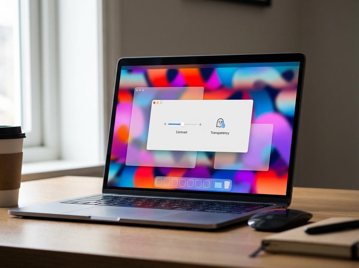
Once you know whether transparency or blur is bothering you more, the quickest global fix lives in System Settings. Open System Settings › Accessibility › Display. Start with the Display contrast slider: move it one or two notches to the right. This slightly darkens frosted areas and sharpens edges so glass panels stop melting into the wallpaper, but the system still looks like Tahoe rather than an older, flat macOS.
Next, try toggling Reduce transparency. With it on, menus, the Dock, and sidebars become mostly solid. This is the strongest relief if transparency is your issue, but it can make windows feel heavier and some backgrounds a bit dull. If that looks wrong to you, turn it back off and rely on a mild contrast bump instead.
Once the global glass is under control, any remaining distractions usually come from specific spots like sidebars, menus, or the Dock.
When sidebars, menus, and the Dock are the main problem
Once you’ve tamed the overall glass, the usual hotspots are Finder or Mail sidebars, the bright menu bar strip, and a constantly visible Dock. These areas sit against your wallpaper all day, so even mild transparency keeps pulling your eye sideways or up to the screen edge.
Start with the Dock. Open System Settings › Desktop & Dock and first shrink the Size slider a bit so there’s less glass on screen. Turn off Magnification if it’s on; bouncing icons plus blur is a lot of motion and glow together. If you’re comfortable with an extra cursor move, enable Automatically hide and show the Dock. That turns the Dock into a “when needed” element instead of a permanent light bar, but it does add a short delay each time you hit the screen edge.
Still distracted by the menu bar and sidebars? In the same pane, set the menu bar to Automatically hide so it only appears when you move the pointer to the top. For sidebars, use each app’s View › Hide Sidebar (Finder, Mail, Notes) when you need a clean reading or writing space. If that feels too extreme, switching to Dark mode or choosing a calmer wallpaper that’s darker along the edges will quiet those panels without fully flattening the interface. If the result now looks a bit too plain, there are softer ways to add depth back without bringing the visual noise with it.
If ‘Reduce transparency’ looks too flat: gentler alternatives to try
Often you turn on Reduce transparency, feel immediate relief, then notice windows now look heavy and a bit lifeless. That happens because Tahoe is leaning on solid blocks of color without the softer gradients and light bleed that used to suggest depth.
Instead, leave transparency on but dial down how loud it feels. In System Settings › Appearance, switch to Dark or Auto so menus and sidebars sit on darker panels that naturally recede. Pick a calmer accent and highlight color; strong neons pull attention to every button and selection. If you see an option like Allow wallpaper tinting in windows, try turning it off so panels keep a stable color instead of picking up whatever is behind them.
Then return to Accessibility › Display and keep Reduce transparency off while nudging Display contrast one step up. This keeps some glass, but firms up edges so text holds its own. Just note that pushing contrast too far can make borders look harsh, especially on cheaper displays. Once the look is under control, the next step is making it physically comfortable to stare at for hours.
Keeping your eyes comfortable: contrast, motion, and text tweaks that help
Once the blur and colors feel sane, long sessions often still hurt because brightness, contrast, and text size are working against you. Start with the basics: lower overall screen brightness a bit using the keyboard keys or Control Center, then in System Settings › Displays try nudging the resolution or Larger Text slider toward the bigger side. Text gets easier to read, though you trade away some on‑screen space, so it’s fine to stop at the first setting that feels instantly more relaxed.
Next, cut back motion. In Accessibility › Display, turn on Reduce motion. Window animations, Spaces shifts, and certain effects become simpler and shorter, which helps if you feel a slight “whoosh” every time things move. The trade‑off is that Tahoe will feel a bit less fluid, but your eyes do less tracking.
Finally, protect the text itself. In Accessibility › Display, experiment with one more notch of Display contrast so letters separate more clearly from their panels, and consider turning on Differentiate without color if you struggle to spot selected items. In apps you live in all day—Mail, Safari, Notes—use their View menu zoom controls to bump text size instead of leaning on tiny fonts. Once you’ve dialed in a setup that feels gentle, it’s worth making it easy to switch to and from that calmer mode when your work changes.
Saving a calmer setup you can quickly adjust later
When you switch from writing to a design review or screen share, you want Tahoe to feel different. Instead of hunting through System Settings, create one fast way to turn your calm setup on and off.
Open System Settings › Accessibility › Shortcut and tick the options you use most—Reduce motion, Reduce transparency, Display contrast. Then a triple‑press of the Touch ID button or Option–Command–F5 toggles them together. The trade‑off: only a few items fit, so keep that list short.
If you like a visible switch, reserve one Mission Control space for calm work—darker wallpaper, hidden Dock, larger text—and another for demos. Jump between them with a three‑finger swipe or Control–Arrow. Comfort becomes something you match to the task, not something you set once and endure.