The AI-editing hype vs. your actual camera roll
You open your camera roll and it’s not cinematic portraits and perfect sunsets. It’s a blurry birthday candle, a group shot in bad restaurant lighting, a screenshot you meant to crop, and a dog that won’t sit still. That’s where AI editors get real—because the “wow” demos rarely show the messy stuff you actually want to share.
Nano Banana can save time on a few repeatable fixes, but it can also introduce odd edges, warped text, or a “why does this look different?” vibe that makes you redo the edit. The goal isn’t magic. It’s knowing which quick edits reliably help on normal photos—and which ones are a trap.
Try one ‘normal’ photo first: can it improve things without changing the vibe?
That “why does this look different?” vibe shows up fastest when you start with a complicated photo. Instead, pick one normal shot you’d actually post: a single person outdoors, a simple room, or a food photo with a clean background. Run one small fix and stop. You’re testing whether Nano Banana can improve the photo without rewriting it.
Good first tries: “brighten faces slightly,” “reduce glare on the window,” “remove the smudge on the lens,” “sharpen a little,” “warm the color a touch,” “straighten and crop,” or “remove the random crumb on the table.” These work best when the request is narrow and the photo doesn’t have tiny patterns (fences, hair, text on shirts) near the change.
The stronger the prompt (“make it professional,” “make it cinematic”), the more it may change skin texture, blur details, or shift colors. Once you see how it behaves on one plain photo, you’ll know how hard you can push it.
When the background is the problem: cleanup + object removal that actually holds up
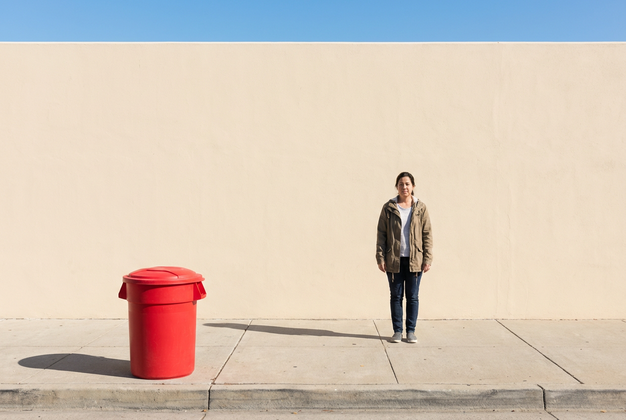
Once you know how hard you can push it, the next real-world test is the background: the exit sign behind your friend, the trash can on the curb, the clutter on the counter, the stranger who wandered into the shot. Nano Banana is at its best when you ask it to remove one obvious thing from a simple area—sky, grass, a blank wall, a smooth tabletop—and leave everything else alone.
Use tight prompts like “remove the red cup on the table” or “remove the person in the back left.” If you can, crop a little first so the target is larger and the fill area is smaller. The fastest win is cleanup that doesn’t touch edges: crumbs, small stickers, a lone wire, a logo on a plain surface.
Where it breaks: busy textures and repeating patterns (brick, tile, fences, hair) often come back as smears or doubled lines, and text near the removed object can warp. If the removed thing casts a strong shadow, ask for that too (“remove the chair and its shadow”) or you’ll get a floating-looking result. After you like the cleanup, expanding the frame is the next temptation.
Got cropped too tight? The ‘expand the frame’ trick—and when it looks fake
That temptation usually hits when you realize the crop is too tight: someone’s head is clipped, your kid’s feet got cut off, or the sign you wanted is half missing. “Expand the frame” can help, but it’s basically asking Nano Banana to invent new pixels that match your photo’s lighting, angle, and style.
It works best when the missing area is simple and predictable—more sky above a horizon, extra wall around a picture frame, a bit more table at the bottom. Prompts like “expand upward and keep the same sky” or “extend the sidewalk on the right, same perspective” keep it honest. If the added space looks a little soft, that’s normal; it’s meant to feel like background.
Where it looks fake: anything with structure or repeated detail—letters on a shirt, railings, tiles, window blinds—often turns into warped lines. Faces and hands near the edge can also come back wrong. When that happens, it’s faster to accept a tighter crop and fix the distractions instead.
Portrait fixes that don’t scream ‘AI’: relight and reduce distractions
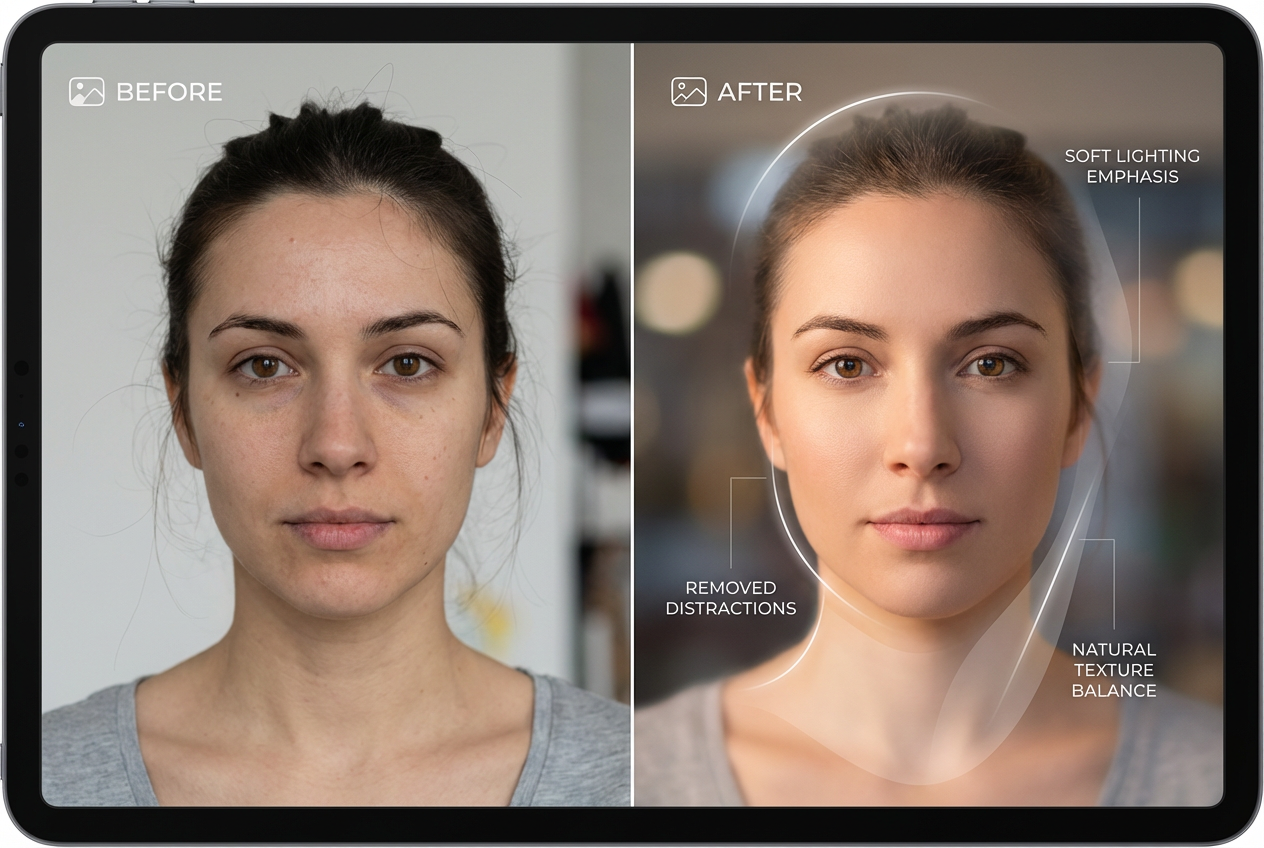
That’s when you keep the crop and try to make the person pop instead. In everyday portraits, the usual problem isn’t “bad skin.” It’s a face that’s a stop too dark, mixed indoor lighting that turns skin green, or one bright thing in the frame stealing attention.
Start small: “brighten the face slightly,” “lift shadows under the eyes,” or “reduce shine on the forehead.” If the light is weird, try “neutralize the yellow indoor light on the face, keep the rest the same.” These tend to work best when the face is clear and not covered by hair, glasses glare, or heavy blur.
Then remove distractions that pull your eye: “remove the stray hair across the cheek,” “remove the lanyard,” “remove the person behind my shoulder.” Friction you’ll hit: it can blur eyelashes, smear hairlines, or soften texture so much the face looks plastic. When that happens, undo and ask for “very subtle” changes, or stick to distraction removal only.
Make it share-ready fast: color vibe shifts and sky upgrades (without neon chaos)
That “very subtle” approach matters even more when you start changing the overall color, because one heavy tweak can make a normal photo look filtered. A fast win is a small vibe shift that matches what you remember: “warm it slightly,” “cool it down a touch,” or “reduce the green cast on skin, keep whites neutral.” This works best on simple scenes—parks, food, a living room—where there’s one main light source and not a mix of neon signs and window light.
If the sky is dull, ask for a targeted upgrade instead of a full “make it epic.” Try: “make the sky a bit bluer, keep it natural,” “add light clouds,” or “recover detail in the clouds.” It holds up when the horizon is clean and there aren’t lots of tree branches, power lines, or hair cutting into the sky.
The trade-off: push too hard and you’ll get neon blues, halos around buildings, or weird tint on faces. When that happens, dial back with “10%,” “subtle,” or “match the original lighting,” then stop and share.
The fun stuff: add text/graphics or stylize the whole photo—worth it or a trap?
Once the colors look right, it’s tempting to go past “fix” and into “make it pop.” Adding text, stickers, or a simple frame can be a legit time-saver for Stories or event recaps—especially if you tell it exactly where: “add small white text ‘Lake day’ at the top left, use a clean sans-serif, keep it subtle.” It tends to hold up on empty areas like sky, a blank wall, or out-of-focus background. Put text over busy hair, leaves, or patterns and you’ll see the usual failures: wobbly letter edges, weird spacing, or text that looks slightly melted.
Stylizing the whole photo (“make it anime,” “make it film,” “turn it into a poster”) is the bigger trap, because it often changes faces and small details even if you didn’t ask. If you want this to work, pick a simple subject, avoid group shots, and prompt for restraint: “light film look, keep skin natural, don’t change facial features.” If it rewrites the scene, that’s your cue to keep Nano Banana for quick, boring wins—and save the heavy style stuff for images you don’t mind redoing.
That decision gets easier when you can name the few edits you’ll actually use every week.
So… should you actually use Nano Banana on everyday photos?
If you can name a handful of “weekly” edits, Nano Banana is worth keeping in your toolkit. The reliable seven are: brighten faces, fix a color cast, reduce glare, clean up small spots, remove one obvious background object, expand a simple edge (sky/wall/table), and add clean text on empty space. Use photos with clear subjects and simple areas, and write prompts that describe the exact change (“remove the red cup,” “warm 10%”).
Skip it when the photo has lots of hair, tiny patterns, or important text near the edit—those are where smears, warped letters, and plastic skin show up and cost you more time than a normal crop-and-adjust. Treat it like a fast utility, not a full makeover, and you’ll know when to tap it—and when to stop.